Misinformation is rife in the post-COVID-19 marketplace. Media planners should remember the fundamental principles of data analysis: correlation does not imply causation, says Starcom UK's Business Director, Jon Manning.
During times of uncertainty, we often try to rationalise what is going on around us to try to find some semblance of order in the chaos. It is what clients look for and pay agencies to provide.
Industry reports like the ones from Enders Analysis brilliantly distil the latest thinking and impact the coronavirus is having on our industry and buyer behaviour. In the era of ‘fake news’, with statistics flying around left, right and centre, it pays to be critical and interrogate any data, sources, articles and reported trends during the COVID-19 period. Especially when today’s society gives everyone a platform to broadcast themselves, no matter how conspiratorial the message.
David Icke spreading misinformation on the deluded connection between 5G and coronavirus, which ultimately led to the deletion of his YouTube profile, whilst also landing Eamon Holmes in hot water with Ofcom when he reiterated Ickes’ view live on ITV’s This Morning, are both recent examples of how misinformation ends up in the public domain. And, most recently, even led to a protest in Hyde Park over the weekend.
It is very easy to take numbers and findings on face value, but with coronavirus affecting so many people’s lives and in different ways, it is hard to draw any firm conclusion or extrapolate any trends from the limited data signals we may have. Not only that, but research fieldwork is also on hold as we maintain social distancing measures, meaning any results we see are often self-reported from dubious panels without the usual rigour applied by extensive fieldwork.
I nearly fell into this trap myself, after reading the excellent piece from Matt Hill at Thinkbox on WARC, I was inspired to recreate something similar to the chart below:
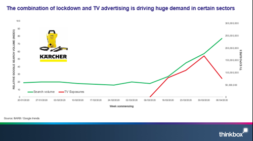
As you can see from Matt’s chart, as the Kärcher TV campaign starts, search volumes markedly pick up. The evidence in this case is compelling; TV has generated search demand for Kärcher pressure washers, which in turn translates to sales, proving TV’s effectiveness at driving sales. As Matt summarises in his article, brands that increase investment during times of recession emerge stronger.
Noticing that a high-street hardware retailer (retailer A), had been active on TV during lockdown for the first time, I recreated a similar graph to Matt’s:
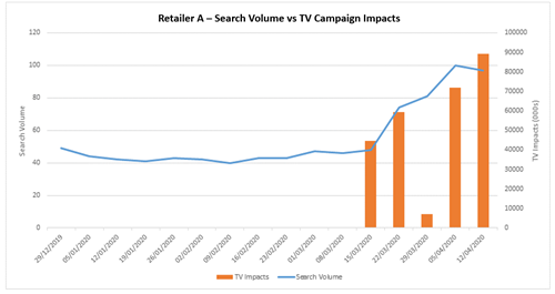
It was exactly what I wanted to see – it was perfect, it was beautiful, it was…flawed!
I was seduced by how the lines and bars fall so elegantly into place but before jumping to any conclusions, I had to keep in mind one of the fundamental principles of data analysis: correlation does not imply causation.
That isn’t to say correlation is never related to causation. Sometimes one causes the other, sometimes the other way around, sometimes something else is driving both – and sometimes it’s just spurious coincidence. Nevertheless, I would be remiss not to look beyond the correlation and investigate what else could be causing it.
I began by looking to see if similar brands are seeing the same search uplift. I chose a very similar hardware retailer as my control, one that hasn’t ever run a national TV campaign, and this was the result:
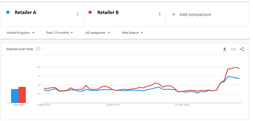
Ah… umm… so retailer B, a brand that has not been active on TV has a seen a bigger uplift than retailer A, which has invested in TV advertising.
Some further rationalising and it seems clear that with lockdown measures in place, people with more time on their hands, good weather and stores closures, retailers like the ones I’ve analysed here that have remained open during lockdown have benefitted organically. Then consider retailer B has considerably more stores than retailer A, and that retailer B’s stores tend to be bigger and out-of-town and therefore probably perceived as safer, and you can begin to build a hypothesis around why this maybe the case.
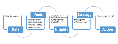
However, it is still just that – a hypothesis. Further data would be required to give a more objective causation of the difference between the two. There is a really useful framework which I often use myself to find the ‘so what?’ from a dataset:
In a time when there is such misinformation out there, it is important to keep this in mind when sharing and compiling information, decks and case studies. We should only act on good solid data – the machine is only as good as the data that feeds it.
As an industry, agencies need to demonstrate where they can add value; it is too easy to jump from data to action, especially as the everyman can do this with readily sourced first and third-party data. The industry needs to take this data, interrogate it, add value to it and draw insight from it to make sure the ultimate action is as effective as possible.
See original article here.

Back to top